Session 2, Oct 16
/NOTICE: We will not meet next Wed, Oct 23—I will be out of town for the evening.
In attendance:
David
Dale
David and I had a productive one-on-one! Since his interest is in design, we focused on those aspects tonight.
We looked at the assigned reading (I.1-3) and pored over the space requirements for those scenes:
how many people are onstage at any given time
what are they doing?
how much room do they need, and for what?
David quickly assessed that although I.1 only had three characters max onstage at any one time, I.2 had the wrestling match and required both space for wrestling and for spectators, both public spectacle and intimate exchange.
Since David is jumping into this with both feet as a beginner, I gave him some basic Lichtenbergian instruction: since he didn’t know what he was doing, it gave him great freedom to fail, to do it all wrong.
I also introduced the precept STEAL FROM THE BEST: since he was a beginner, go ahead and start picking apart other designers’ work. I promised to bring him some issues of American Theatre for him to peruse, cut up, and use for his design morgue.
One idea I had seen recently became our focus for the process. It’s a concept I’ve seen in multiple sets, simply a raked, circular wooden boardwalk:
(We didn’t discuss it, but the “wooden O” aspect of it would be a great pun for those who got it.)
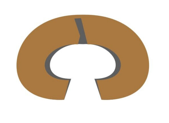
We decided that the circle would be a bit restrictive for the action, so David suggested breaking the front part open:
This would give a pit for the wrestling match plus the spectators, plus seating for the more intimate scenes between Rosalind and Celia earlier. I pointed out that the tussle between Orlando and Oliver in scene 1 could be staged in the same pit, foreshadowing the wrestling match. Also, the levels would allow us to put Oliver at the top, with Orlando opposite below: tension in the opposition, broken when they get close to each other and violence ensues.
Then David, thinking ahead, suggested breaking the thing into two pieces:
On wheels. Raked, and movable. Sure, I said. John (NTC’s tech director) can build anything. I encouraged him to go wild in his ideas, even things he might be sure would be impossible.
I found some scrap cardboard in the scene shop and we quickly created two little cardboard C’s that we could play with. (I referenced architect Frank Gehry’s habit of doing exactly this in his studio, quoting his mantra, “Let’s let it sit there for a while and annoy us for a while.” [p. 114, Lichtenbergianism])
I pointed out to David, who had crewed last spring’s Peter & the Starcatcher, that we had done the same thing with the “torture devices” and how well that served our needs.
He then played with the recombinant possibilities a bit before I moved into one of the items on my agenda for the evening: scarcity as a spur for creativity.
Here follows a lengthy story of one of my best design decisions.
Back in 1997, I was about to direct A Midsummer Night’s Dream for the second time. My problem was that the theatre company was broke. We had almost no money in our checking account, and here I was doing a major show. I scoured the theatre for what we had that we could turn to our advantage.
I found a large roll of brown flannel and a large roll of lavender chiffon, both of which had been donated at some point. And that was about it.
Well.
Fellow Lichtenbergian Marc and I had already brainstormed a theme for the show, the three words DARK DREAM DESIRE, and for some reason—I will never understand where the idea came from—I decided we would build wooden frames which we would suspend from the ceiling. From the back we’d hang the opaque brown flannel; from the front, the translucent lavender chiffon.
We surrounded the audience seating area and the performance area with these things, creating a diorama background that allowed multiple entrances, plus the ability to be “invisible.”
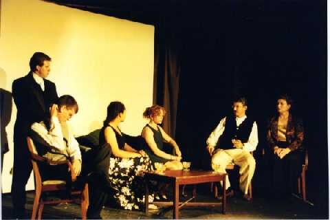
In Athens, everything was in black and white, backed by a large white square. Very stark.
Apologies for the photo quality: it was 1997.
l to r: Josh Hill, Mike Funt, Cassie Carter, Heather Kline, me, Jan Manning
Here’s the magic: When the action moved into the woods, that large white square floated up (pulled by hardy cast members from the second floor), and the stage was empty for a moment. Then fairies began appearing in the lavender fringes. They crept out and over to the audience, enticing/compelling them to leave the seating area, to bring their (lightweight plastic at the time) seating with them, and place them as they chose around the playing area.
Thus the orderliness/rigidity of Athens (as ill-adjusted as A1 scenarios all are) gave way to the chaos of the fairy-controlled woods.
All of this impacted the direction of the show: when actors wanted specific entrances and exits, I shrugged and told them nope, they’d have to wing it each and every performance, since we couldn’t really control where the audience members would end up. Come in and exit wherever you want. And change it up.
Blocking was the same: stay alert, play the space, pay attention to the needs of the scene. The fairies were given a set of rules within which they had carte blanche to do whatever they wanted in any performance. It was mayhem. It was great fun.
And then, at the end of the show, after we’ve returned to Athens and laughed our asses off at the idiots on parade in “Pyramus and Thisbe”…
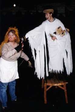
Jen Doran and Sarah Fineout Logsdon, both theatre professionals now
…Theseus takes us all off to bed. The rude mechanicals return to strike their props. The great white square floats up out of the way, and the fairies return to bless the house. Only Bottom senses their presence.
As the fairies sing and crisscross the stage, the rude mechanicals continue striking: they untie the ropes of the diorama frames and lower them to the floor. While Puck is delivering the epilogue—this was all a dream, folks—the audience finds their enchanted space vanishing all around them. Actors are revealed changing back into their street clothes; the director is at the laptop running the sound.
Finally the cast turns to face the audience as Puck finished with three simple words:
Andrew Stroud as Puck
DARK. DREAM. DESIRE.
No false modesty here: this was amazing theatre. And it was mostly because I couldn’t afford anything more elaborate. Wooden O indeed!
My challenge/assignment for David was this: I had purchased two cheapo canopy tents for the burn last spring. When they arrived, I realized they would last two burns at best, but they would allow us to confirm that the camp needed that much living space; if we wanted, we could replace them with sturdier, more expensive versions. This proved to be true: at this past Alchemy, we could barely keep them together, and by the end of the burn they were rubbish.
So now I had two 10x30 white canopy covers with no real use for them (along with their flimsy metal tubing). If this is what we were faced with using for our set, how could we do that? David is to imagine as many uses as he can for them for our next meeting (Oct 30). I can’t wait to see what he comes up with!
Finally, we looked at the closing scene: a freaking pageant in the middle of the woods! Never mind how Rosalind pulled this off, how were we going to? One idea unrelated to actual staging was to close the wooden O back into a perfect circle for the very end: A1 —> B —> A2, after all.
Next session: NOT next week. Oct 30, 7:30–9:00
ASSIGNMENT
Read II.1–4
Read V.4, from Hymen’s entrance, i.e., the final pageant
Look at ways that we can show how the action moves from A1 into the Temporary Autonomous Zone of Arden Forest and back again.
David has a couple of personal assignments:
Begin developing color palettes for the dichotomies of the Court and Arden
Steal ideas for set designs
Explore his wooden O idea for other scenes
Brainstorm as many ways to use the canopy tents as possible


