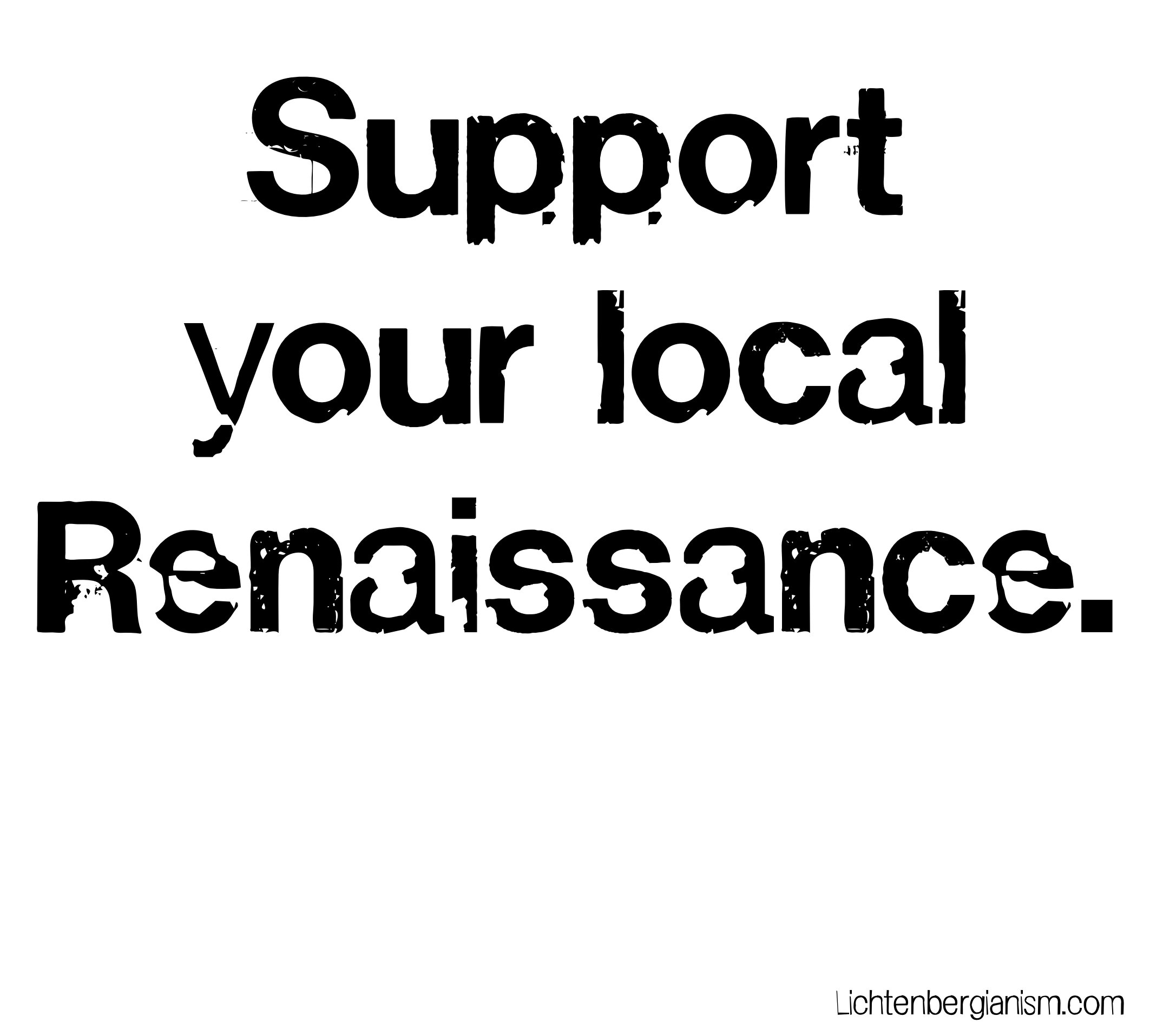
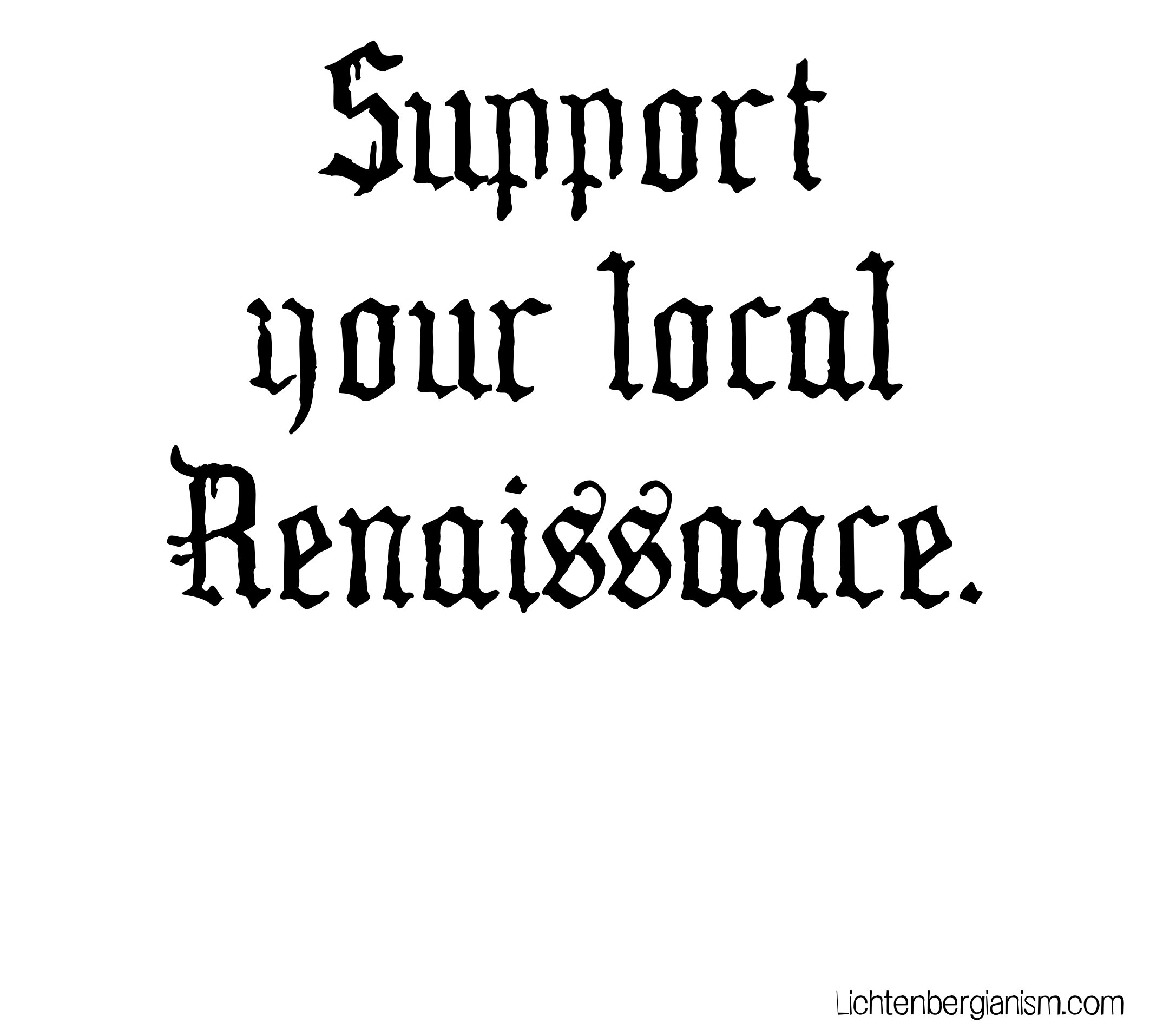
Pick one.
/You may be aware that I have a CafePress store, where you can give me money for a variety of Lichtenbergian products, but also for a small section of quirky t-shirts. I’m very pleased with my creations; I wear mine constantly.
The other night I was for some reason reminded of a slogan I came up with more than 40 years ago: SUPPORT YOUR LOCAL RENAISSANCE.
Aha, thought I, this would make a great t-shirt.
The impetus behind the slogan is, of course, to exhort people to make art happen where they are, not just consume commercially successful, “perfect” art from elsewhere. If you’re not an art-maker, then be an art-gardener — act as your town’s Medici family and create an environment where art-making can flourish. That’s what I did at Newnan Community Theatre Company all those years, and it’s what Kim Ramey is doing at Backstreet Community Arts now.
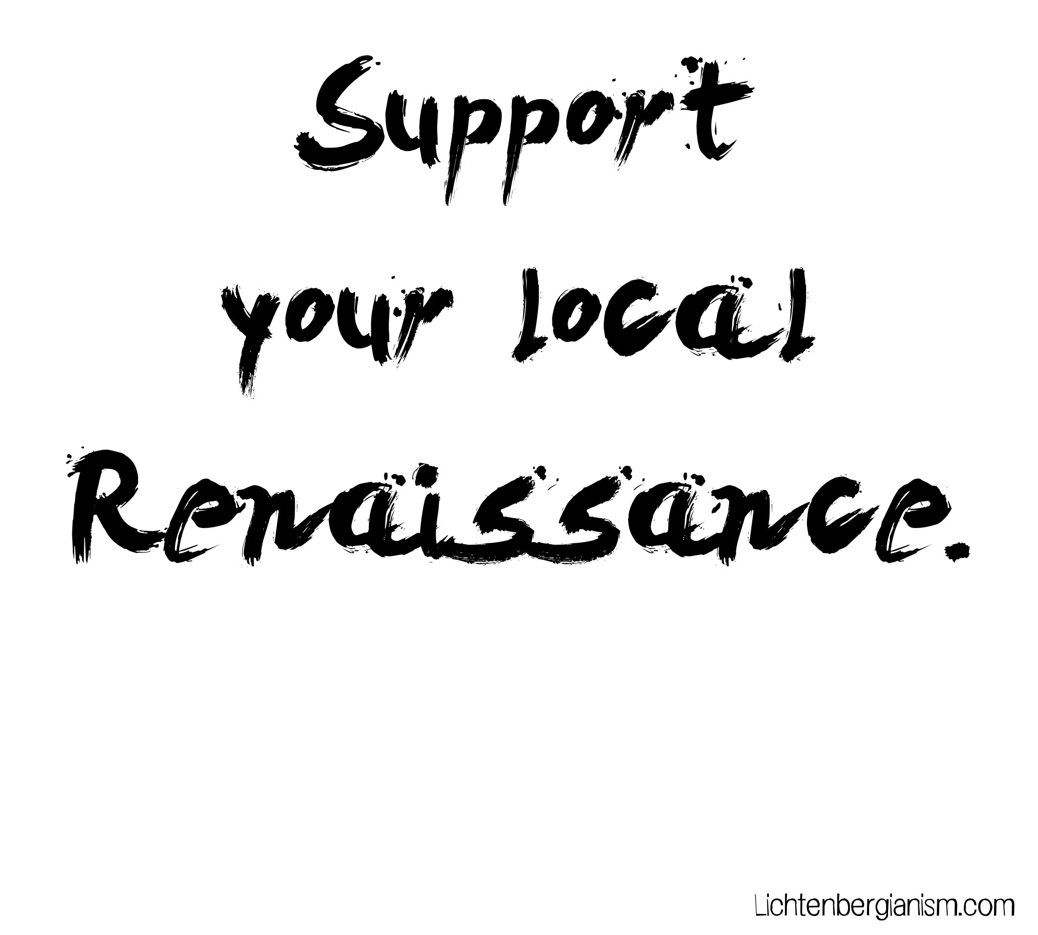
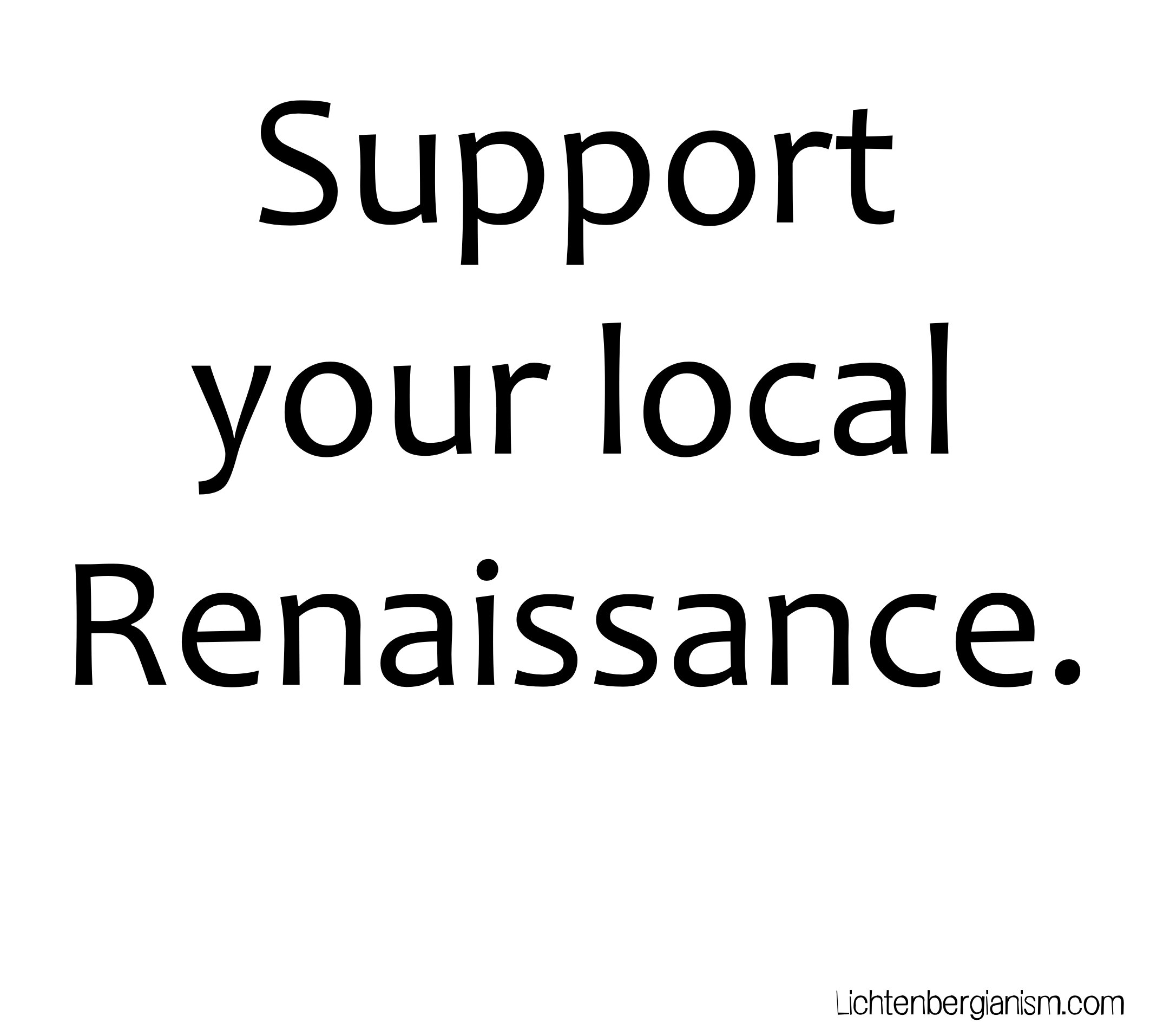
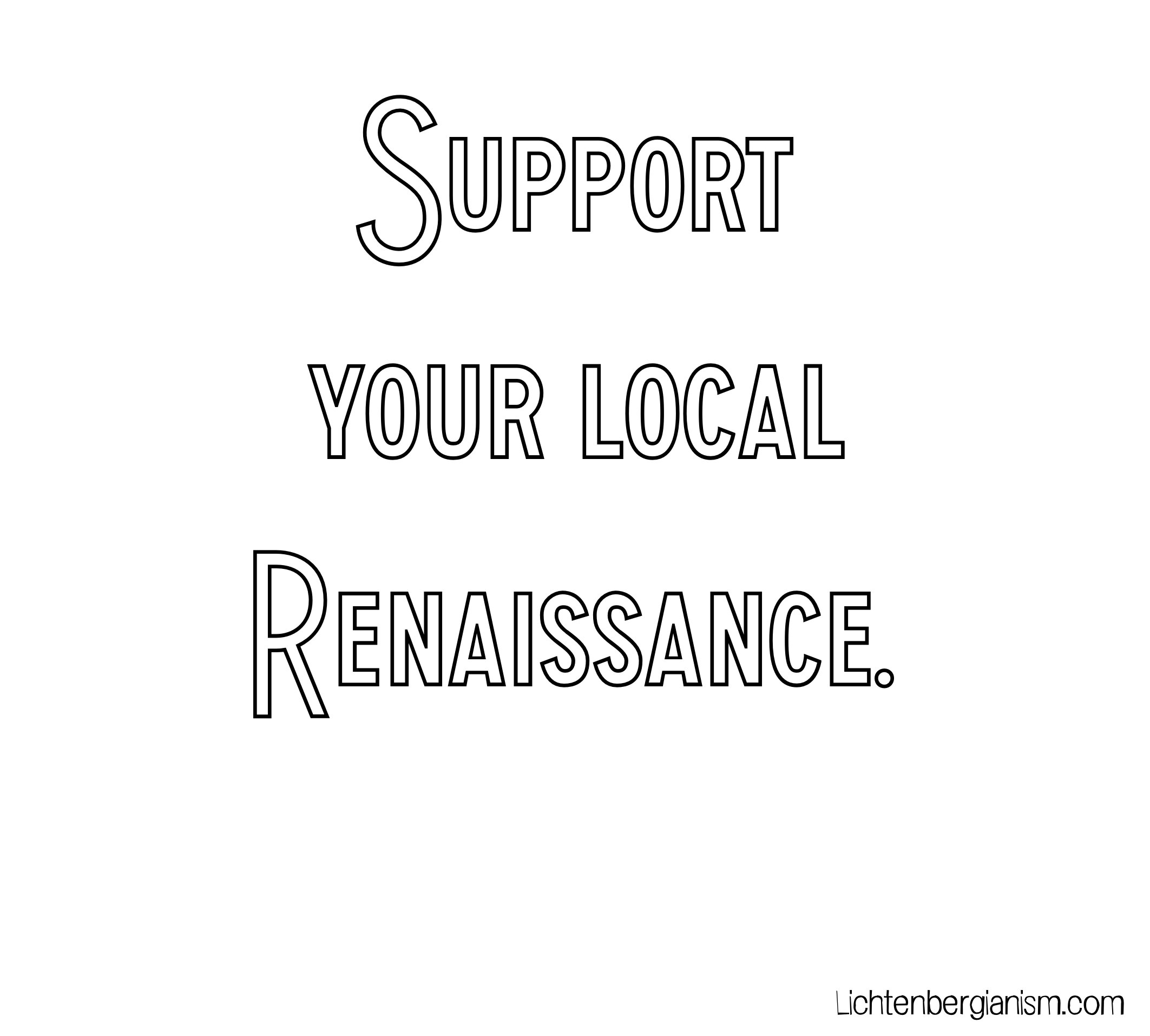
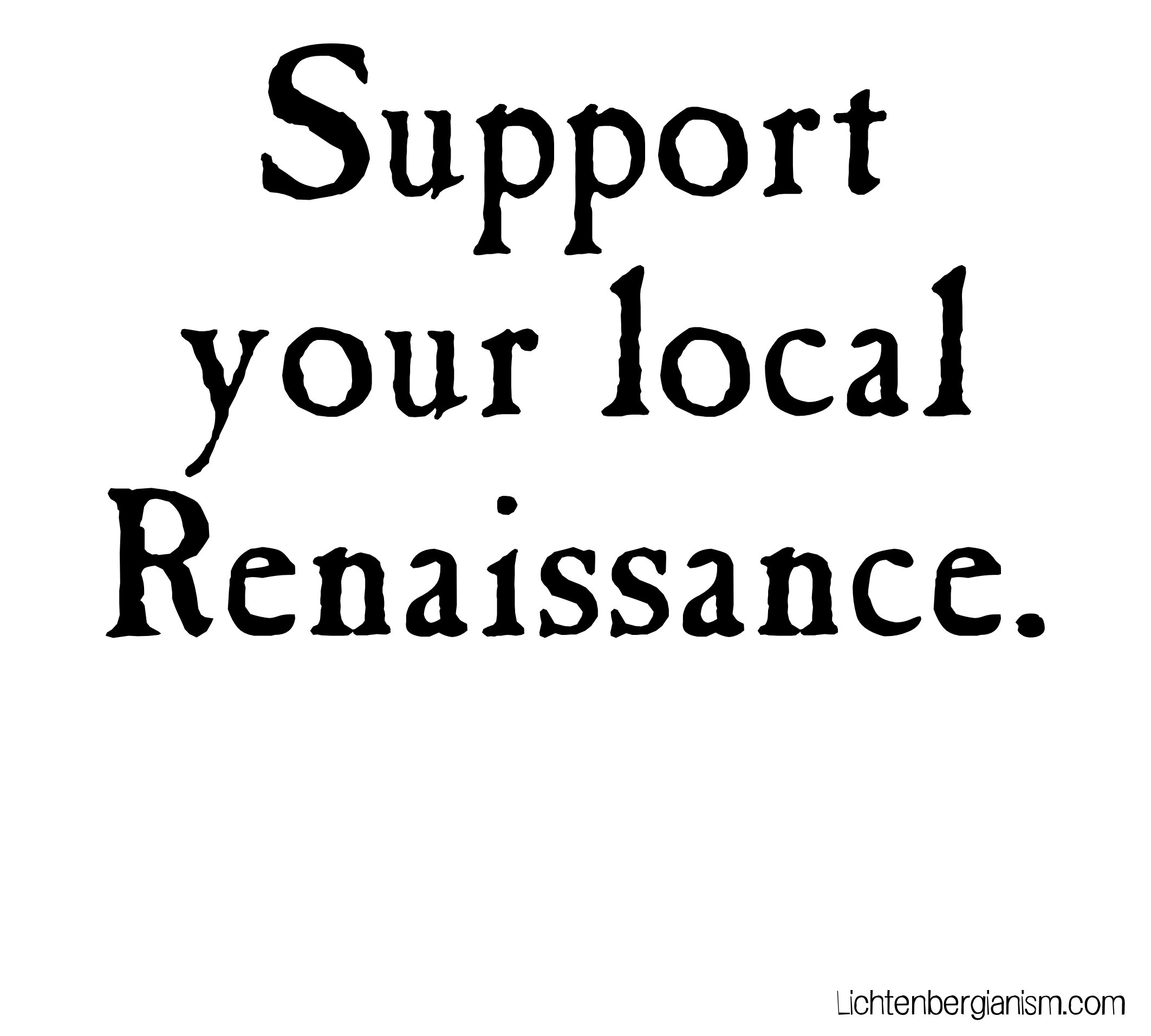
So I dug in this morning to create the graphic for the t-shirt, and that’s where I need some other brainthoughts to decide. Because fonts. (There will be a gallery at the end for your actual decision-making purposes, so you don’t have to scroll back and forth.)
(These images are just font samples. Actual sizing/spacing would take place after we decide on one.)
One’s first impulse is to go with an antique/blackletter approach, i.e., actual Renaissance-flavored fonts.
WW2 Blackletter HPLHS
But blackletter fonts are hard to read, and we want the t-shirt to have an immediate impact, almost an order: Support your local Renaissance.
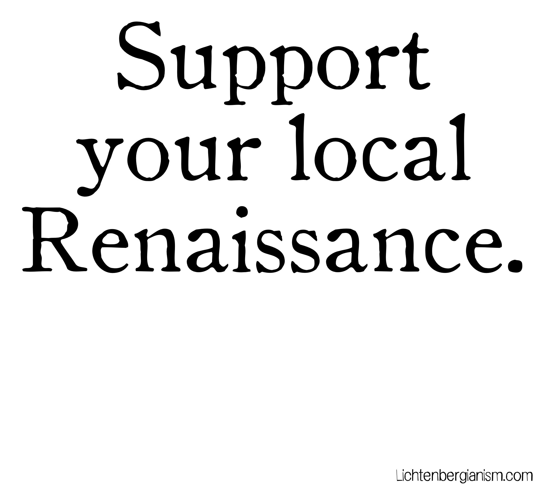
Maybe an older looking font…
Caslon Antique
Oldstyle HPLHS
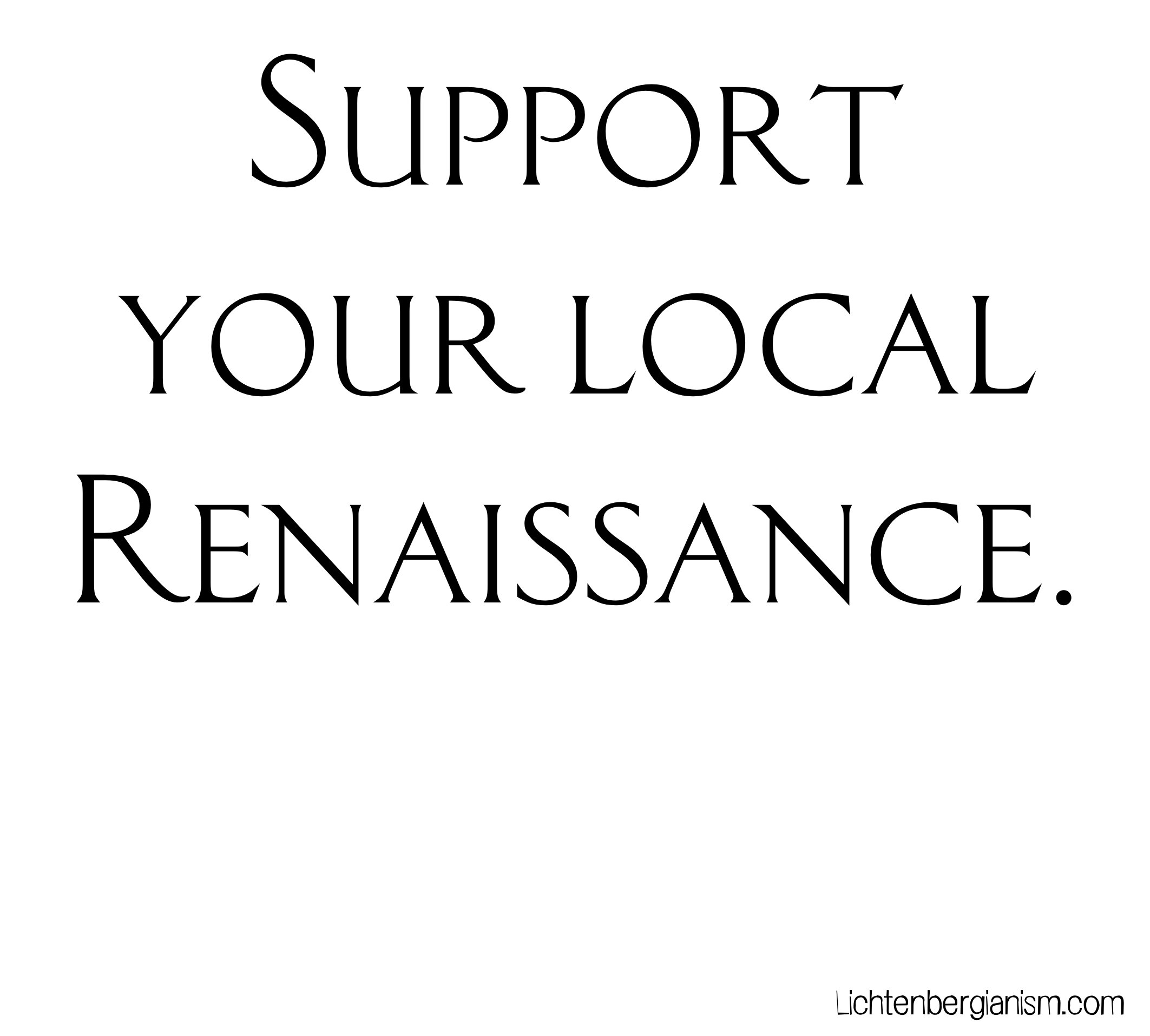
If not distressed type, then perhaps the clean lines of Roman/Renaissance engraved lettering…
Classic Roman
Or cool, elegant modern…
Candara
Canoe Trip
Those last three are more legible, so that’s a plus.
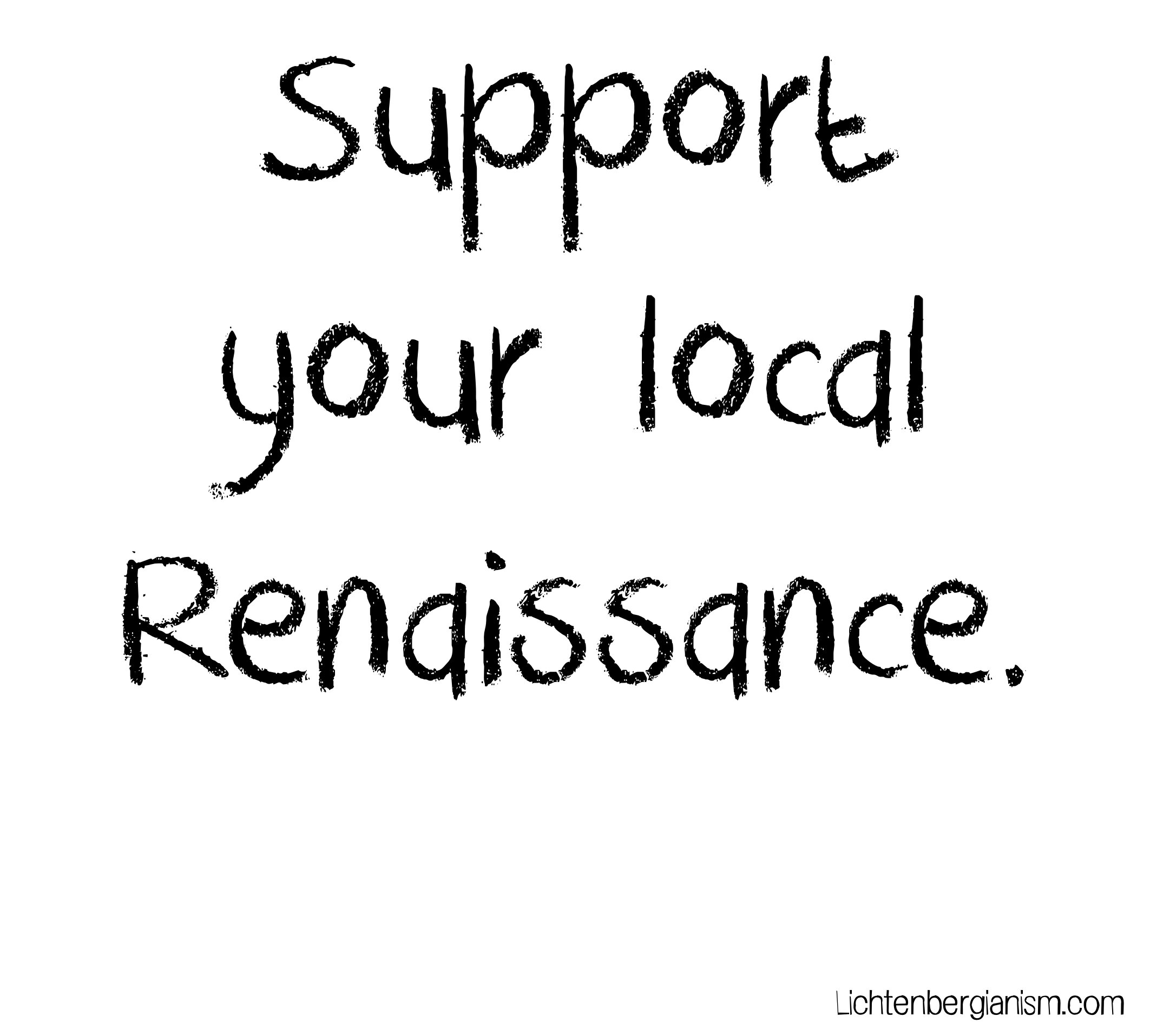
Modern handwritten/grunge…
Bigsplash
DK Crayon Crumble
Swiss Grit
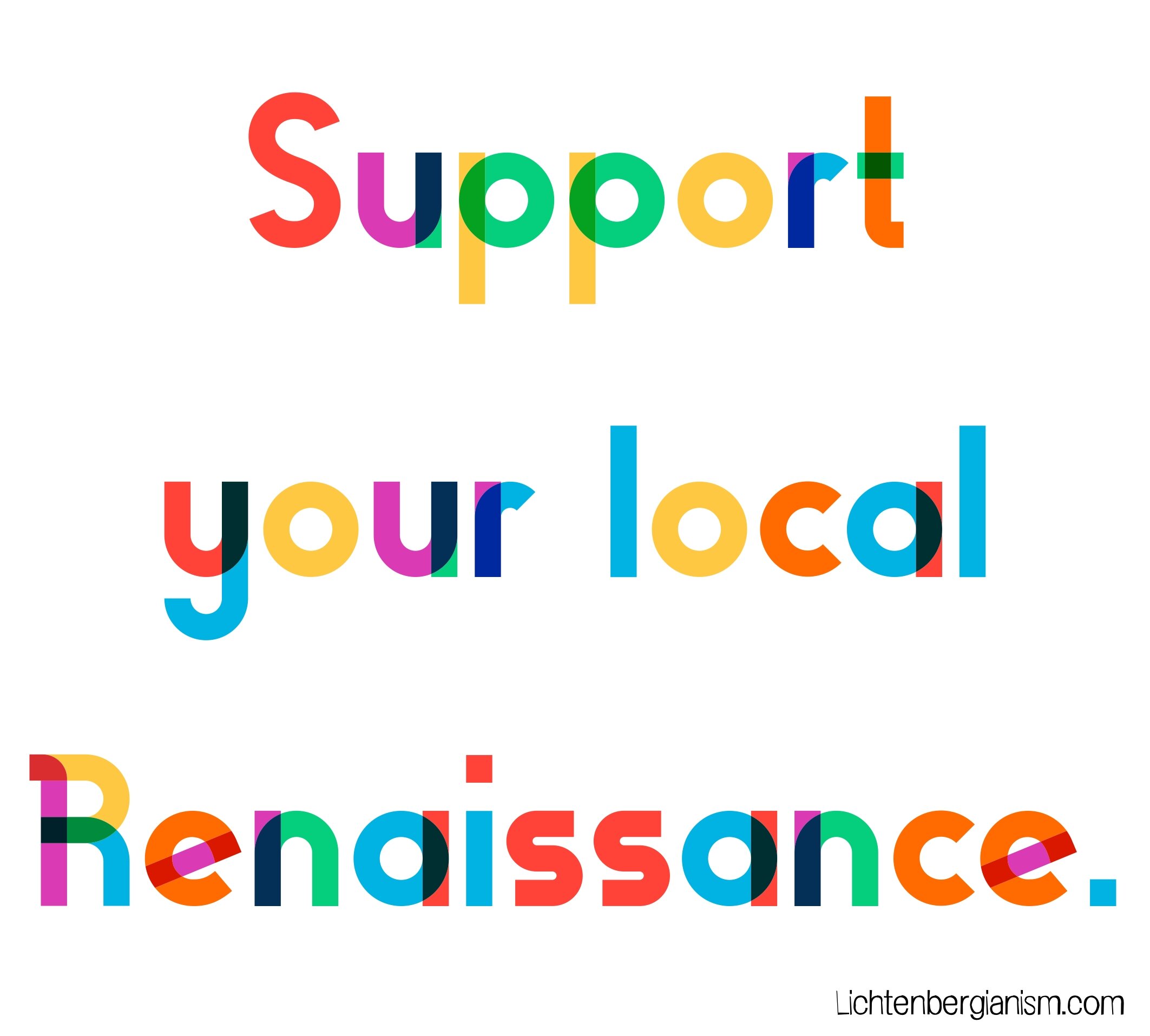
And there’s always the opportunity for whimsy…
Gilbert Color
At the moment I’m leaning towards… Classic Roman? I don’t know. Pick one. Leave your choice in comments. If you don’t like any of them, I have a couple hundred more fonts we can consider.
And yes, the word Renaissance begins to look alien after a while.


