A master shows us Successive Approximation
/Gustav Klimt (1862-1918) was dazzling in his own day and remains one of the most astonishing artists 100 years after his death.
I was fortunate enough recently to visit the Belvedere Palace in Vienna, where many of his most famous works are.
His most famous of course is The Kiss:
There is no photography in the Belvedere, but right next to this astonishing work is a small rococo chamber with a full-size reproduction for selfies. Mercy.
Anyway, look at the intricate surface decoration of this piece. It's pretty fevered, and the more you look—especially when you're in the same room with it—the more you see.
Hold that thought.
To understand the impact of Klimt's work on Belle Epoque Vienna, let's look at a series of portraits.
Here's one from 1894:
This is a perfectly perfect example of traditional, academic portaiture at the end of the 19th century. The photorealism is striking: even close up I could not make my eyes see the brushstrokes in the woman's bracelet, for example. They were diamonds, and nothing could convince my brain otherwise. Likewise, the textures of the woman's gown, her hair, the upholstery, her skin tones: all are designed to invite us to see the real thing.
But then...
This is a portrait of Fritza Riedler from 1906. Under the influence of Japanese art (Japanoiserie was huge at the turn of the century) Klimt has flattened the space in his portrait. Flesh tones are more "painterly." The gown is suggested rather than rendered.
But mostly we are led to focus on the décor: the textures of the walls, the geometries of Art Nouveau, with the tiled fans (stained glass?) creating a virtual halo around the subject's head. The small tiles are not quite randomly placed. There's the larger tile along the baseboard, which to me suggests that it was occasioned by Klimt's GESTALT process: he needed the black there, but he needed something to make it more integral. And all of it is flat, practically two-dimensional.
Go back and look at the first portrait. Compare these two paintings again.
Now:
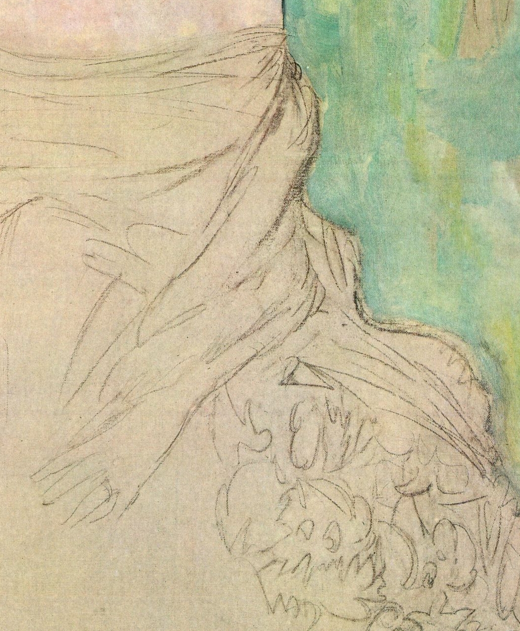
This is a portrait of Amalie Zuckerkandl, unfinished at the time of Klimt's death in 1918. He has clearly finished the important part, the client's face, but the rest of the painting is still just a sketch.
Here are the lessons to be learned:
1. If you ever believed the King of Hearts Fallacy, that artists just start at the beginning, go until they reach the end, then stop, this painting should cure you of that once and for all. Klimt was feeling his way to his finish. Yes, he was a master; yes, he'd done this before and probably had a good idea of where he was going with it, but the fact remains that this is what art looks like when it's being created.
2. Look at this part of the sketch:
Does that look anything like what you would expect from the polished academician who made the first portrait above? Of course not. It's an ABORTIVE ATTEMPT. As we've seen before, by the time he finished, that hand would probably be in another pose altogether. And the fabric of Amalie's gown/wrap? Klimt might have known what it was, precisely, but we don't.
3. Another close-up:
Look at those washes of color. This is not a Klimt background, is it? Again, it's an ABORTIVE ATTEMPT. He's sketched in those decorative background blips, probably tiles like in Fritza's portrait, but he's made no attempt to define them. That would happen later in the process, probably in tandem with the gown as he explored his decorative surfaces. Which leads us to...
3. What is this even?
Here we see Klimt beginning to explore the GESTALT of his painting: seemingly random brush-fuls of color that actually show him thinking through which colors might be effective and where they might be placed. He's already working through SUCCESSIVE APPROXIMATION to begin to refine his approach to the work. If he worked anything like I do, then those blobs might also be reminders, a quickie WASTE BOOK approach, so that he didn't forget an idea when he had it.
So STEAL FROM THE BEST. Look at Klimt's process and free yourself from the straitjacket of your preconceived notions about how art is created: it's messy, it's always a risk, it is never surefooted.
—————
Feel free to leave comments on this or any other post!


